
Creating Worlds with Form Follows Function
By Feng Zhu
AN EASIER WAY TO BUILD YOUR PORTFOLIO
That first step of getting into the professional concept art industry is one of the hardest. You are literally asking someone else to pay for your ideas. Think about that for a moment. You have to convince some studio or person out there to trade their hard earned money for thoughts in your head. Thus, you need to ask yourself a very honest question - are your drawings and designs worth any monetary value? And if so, how much are YOU willing to pay for them? If the answer is “not much” or “zero,” then how are you going to convince someone else to it?
To most younger students and designers, they tend to solve this dilemma by doing the two following things. One, design stuff that “no one else has seen before!” And two, emulating designs that are trending on social media. They think that by doing these two topics, studios and other pros will take notice of them. This can’t be further from the truth. In fact, it probably has the opposite effect. Let me break these two topics down a bit.
The “designing something no one else has seen before” approach probably hurts young designers the most. This usually leads to random portfolios with poorly thought out concepts which are nearly unusable in the real world. It’s akin to a level 1 player trying to take down a level 50 boss. You simply don’t have the experience to pull it off.
Having grand designs are fine, but leave it to the level 50 players (art directors with 20+ years of experience). Very few studios will hand off their multi-million/billion IP to a junior designer. Senior designers and art directors are called senior for a reason. They have the experience to lead projects and define visual styles. A junior designer works under them and needs a portfolio which demonstrates this supportive role. Don’t get ahead of yourself yet with grand portfolio content. You have another 35+ years ahead of you to do this, so be patient and take one small step at a time.
Onto the second topic - emulating pros. Again, you are trying to beat a level 50 boss with a level 1 character. Maybe 1 out of 1000 can pull this off, but most will fail. When we pros see these types of portfolios, we immediately know what you are trying to do - attempting to skip the level grinding and get to the end boss as fast as possible. This type of portfolio content is basically “fan art of concept art.” It doesn’t require much effort, time and thought process. It’s simply emulating. Portfolios are not about just drawing well. It’s about understanding fundamentals, knowing design languages, solving problems and communicating ideas to others.
Studios and professionals are experienced and have been in the game for a long time. They know what they are looking for. You can’t fool them by filling a portfolio with just pretty pictures. Through your portfolio, we need to know how knowledgeable you are. Your understanding of history, culture, fashion, architecture, interior design, vehicles, biology, our current society, etc. The list goes on and on. An empty shell of a portfolio with a generic green Orc commander missing his left front fang is not going to cut it. Neither does another alien landscape with volcanic spiky mountains and red lava veins.
You are probably feeling a bit down right now? Well, let me cheer you up. It’s not as hard as you think! In fact, you can probably get your first job without even designing much at all. How you ask? It’s about understanding the game (industry) and building a value-worthy portfolio to match.
As mentioned above, a portfolio needs to demonstrate the understanding of fundamentals, knowing design languages, solving problems and communicating ideas to others. Well, you can accomplish all of these by utilizing the “Forms Follows Function” design methods I'll be outlining here.
Most real-world designs are derived from function and took thousands of hours to conceive and refine. We simply leverage these existing designs and apply a small change to make them stand out, but grounded enough for production. Think of this way - instead of baking a cake, you are just adding the frosting on top. So even if you mess up the frosting a bit, the underlining cake is still good. But don’t get this confused with the generic orc. That is not a good cake to start with. You want to start with a homemade, grandma passed down, 100 year old recipe, cake.
In this article, I’ll recommend eight different design approaches (good cakes); all of them grounded and uses the forms follows function approach. The topics I chose are also beloved by probably 90% of art directors out there - making your portfolio very eye pleasing. This is how the game is played. Build portfolios that the industry wants to see.
Onto the Show!

Before we get started, let’s do a quick breakdown of what is form follows function. Simply put, we design from the inside out, instead of outside in. Most importantly, everything hinges on function. Take this cassette player example above. Its function is to play a cassette tape. In order to do that, we’ll need a series of parts (inside out), starting with the gears which turn the tape. Then we’ll need a motor to turn the gears, power supply for the motor, buttons to control everything, speaker to play the sounds, etc. As a result of all these parts, the outer form takes shape. This is form follows function - the inner “packages” dictate the outer form.
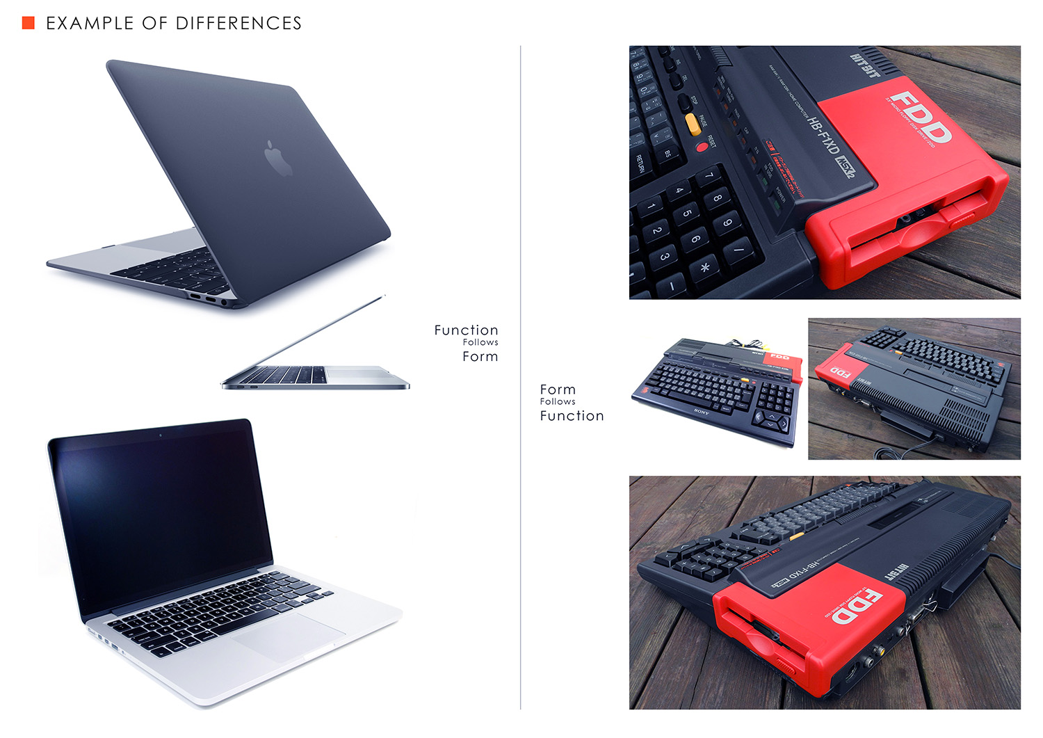
In this next example, we look at a Mac laptop against an early PC. Apple prides itself on good visual design. To reach this goal, they design from the outside in (functions follows form). A PC on the other hand, usually values function first. They are generally more bulky, have a ton of buttons and blocky shapes. Both of these designs look cool, but the approach is different. For this lesson, we will be focusing on the right-side PC.

And here are the same approaches applied to architecture. The left side focuses on outside in, whereas the right focuses on inside out. Both solutions are visually impressive, but for a junior designer, the castle approach is easier because you can arrive at the forms through function.

I like this approach because it makes things a bit easier. If you rely purely on form (outside in), you can spend hours and days sketching random shapes and get nowhere. By focusing on inside out, you can get to solutions much faster. It also avoids the “helicopter dropped” designs. See that tower above with a helicopter? It just exists for no reason. It’s in the middle of nowhere and doesn’t seem to have a function. Is it cool? Maybe. But does it show your thought process for portfolio? Nope! But the real castle and surrounding landscape image above it does show function. It’s a lot more believable because it’s real.

Design is about solving problems, just like these mazes. If you are doing the “nobody has seen this before” approach, welcome to the left side maze. It’s much harder to solve because there are no groundings. There are almost no rights or wrongs when it comes to something “made up.”. For an inexperienced designer, they’ll often be trapped in this maze forever and produce nothing after an exhausting endeavor. The right-hand maze still requires problem solving skills, but since we start with grounded subjects, most of the problems have been already solved for you. All you have to do is combine everything together nicely.
Concept Artists Love Towers
We concept artists love to draw towers. I’m in the same boat. But if you are still learning, you can try to apply just a bit of function into your tower. It’ll add so much more depth into your design. Take a look at these real world towers. Notice they all serve a purpose and their forms are all driven by function. I’m using towers as an example here to demonstrate the importance of function before we head into the actual design approaches.

Eiffel Tower - Originally built as an art piece, it now serves as a radio tower
Castle Tower - Build to protect the soldiers inside with small windows while allowing them to see far and defend when necessary
Fire Watch Tower - Build high up and with big windows. Their purpose is to see as far as possible
Water Tower - Use gravity to pull water down
Clock Tower - Clocks on all four sides to allow everyone to see
Light Tower - Generally painted to contrast the environment, its purpose is to warn ships of land
Airport Tower - Allow ATC to see incoming and outgoing planes
Religious Tower - Rises high into the air to worship the Gods
Rocket Tower - To hold up the tall rocket
Building Towers - To live in a limited space
Finally, here are my eight design approaches which relies on Form Follows Function.
My Favorite Design Approaches
1. NATURAL CAUSES
Nature gives us a lot of cool designs. In the first example, I use weather as the cause. One functional solution is to build structures within canyons to avoid the harsh winds. I'm using natural mountains and the culture of ancient Japan as my 90% grounded base. Remember, leverage what existed before and just combine. I demonstrated this approach in episode 94 of Design Cinema.
The second example is utilizing a beautiful landscape provided by nature. We combine this with an ancient dam and surrounding town; making for a functional, grounded, historic and interesting location.


2. MAN-MADE CAUSES
Mankind creates a lot of problems. Let’s leverage two of them. In the first example, I use overpopulation. To solve this issue, I chose to move public spaces to the outside. No more hallways, lobbies, inner courtyards, etc. inside buildings. As a result, all elevators and stairs are on the outside. This creates a new visual without doing too much design work.
In the second example, I use pollution. In this world, instead of trying to clean the air, the population decides to just accept it. Since it’s so polluted outside, windows become obsolete. Buildings and vehicles in this world are devoid of all windows. Again, this creates a new visual with minimum work on your end. And for fun, perhaps the interiors are bright and colorful (via LCD screens), creating a nice contrast to the outside world and establishes the selfishness of the population.


3. SWAPPING TIMELINE
One of my all-time favorite design approaches - take something functional from current day and apply a historic visual on top. In the first example, take the mega-mining facilities of today and replace it with ancient Chinese history. Swap trucks for donkeys, industrial metallic smelters with brick structures, etc.
In the second example, I found this cool train loading yard in Europe. Simply swap out the asset with ancient ones. Horse carts for trains. Metal towers for wooden ones. You’ll end up with a visual that is both cool and functional.


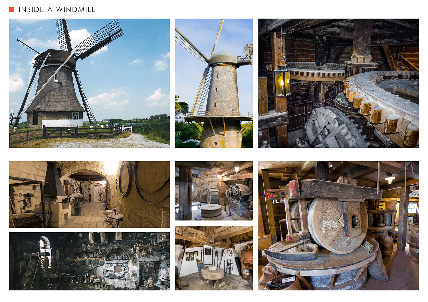
4. SHOWING INTERESTING REAL WORLD DESIGNS
Sometimes you don’t have to design a single thing. Simply show the audience something they haven't seen before. For example, the inside of a research ship or windmill. Even though these things are real, that doesn’t mean they can't be used to entertain people. Seeing the inner working of a research ship has the same effect as seeing the bridge of a star ship. Both are foreign to most audiences. You don’t need to “make stuff up” in order to impress someone.
Countless movies and video games have used this. The Abyss, Captain Phillips, Deepwater Horizon, etc. come to mind.

5. REAL WORLD PERIOD PIECES
I highly recommend having at least some period pieces in your portfolio. You literally don’t have to design a thing. All you have to do is bring that history to life. Seeing Shanghai in the 1920's is the same as seeing a planet in Star Wars. So instead of scratching your head to come up with “something different,” just use history. Look how many successful games and films have relied on this.
On games: Assassin’s Creed Unity, Origins, etc., Red Dead Redemption series, Far Cry series, Mafia series, etc.
On films: Gladiator, Saving Private Ryan, The Last Emperor, The Last Samurai, Master and Commander, Elizabeth, etc.


6. REMOVE FUNCTIONS
Another favorite of mine. Remove a major function and solve the problem. For example, what if cars didn’t exist and the world only relied on trains. Look how cool the visuals can be! And 90% of the designs have already been solved for you. This is what entertainment design is all about - showing us something cool. It doesn’t have to be a crazy world and everything made up from scratch. Just change things up by 10% and you’re good to go.
What if the world didn’t have airplanes and blimps took over - something that almost happened perhaps in the 1930's. Well, show us this world. Use references and put it together.


7. LOOK TO THE PAST FOR VISIONS OF THE FUTURE
I love flipping through old Popular Mechanics and Science magazines. They showcase a world of tomorrow that was envisioned in the limitations of its day. This resulted in some very interesting visuals that are difficult to imagine today. Most of these ideas might no longer work in today’s world, but we can certainly bring them to life in the entertainment realm. The game series, Fallout, for example, uses this approach. Now go to Pinterest and start collecting cool references!


8. COMBINED FUNCTIONS
And lastly, a design approach that is commonly used in the entertainment industry. Take two existing designs from the real world and combine them together to form a new design. This is similar to the swapping history method, except the design solution needs to be more integrated. You can’t simply swap. However, if you find the right combinations, the result can become timeless. Steampunk is one of these examples. It takes the functionality of steam engines and apply them to everyday items such as computers and clothing. The result is something we are all very familiar with. Imagine if windmills were used to power an ancient city or feudal Japan were built vertically like our modern skyscrapers.
Games such as Dishonored, Thief, and Deus Ex Mankind Divided all utilize this design approach.


LET'S GET STARTED
I hope these eight design approaches have inspired you to rethink your portfolio. If you are able to accomplish this, art directors will see the value and effort in your work. Now go get some fresh air, open up that notepad, and start thinking and drawing. In my follow-up blog, I'll put up some examples showcasing these design methods.
